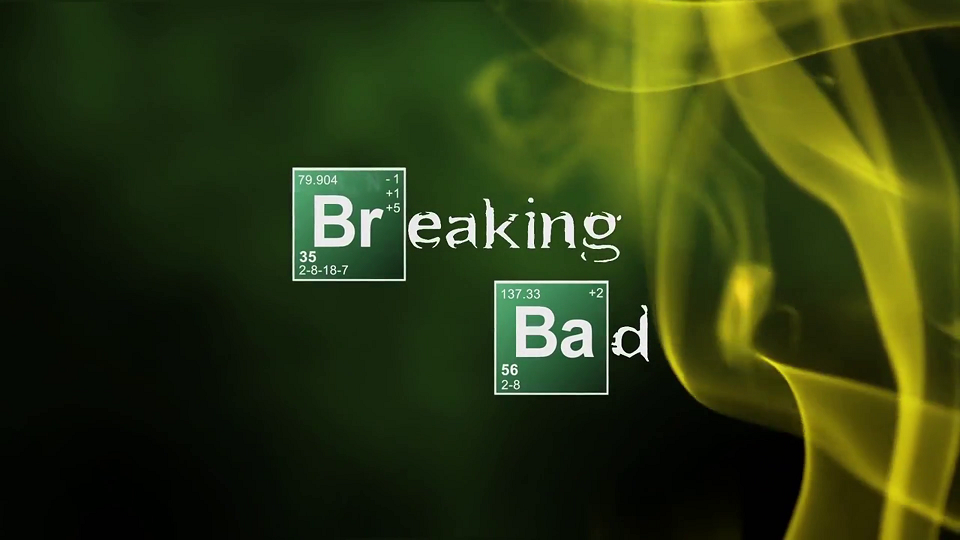
Widely considered to be one of the best TV shows to ever grace our screens, Breaking Bad brought us a desperate meth-slinging chemistry teacher on a downward spiral into a life of crime. Walter White was such a compelling character because unlike your standard on-screen druglord, this guy really knew his chemistry. That is why the incorporation of the chemical symbols in the title of the show works so well!
The first two letter of each of the words in the title are stylised into blocks from the periodic table of the elements Bromium and Barium, and the inclusion of all the atomic numbers is a nice touch. The text in for the chemistry symbols is Helvetica, bold and sans-serif, while the rest of the text is more novelty with its broken appearance. The contrast between the two fonts makes a huge impact on the viewer as it shows the juxtaposition between Walter’s two worlds; his professional life as a respected chemistry teacher, and his life in the world of crime. The imagery of the smoke swirling over the text in the opening credits also reflects the content of the show’s drug dealing and using themes.

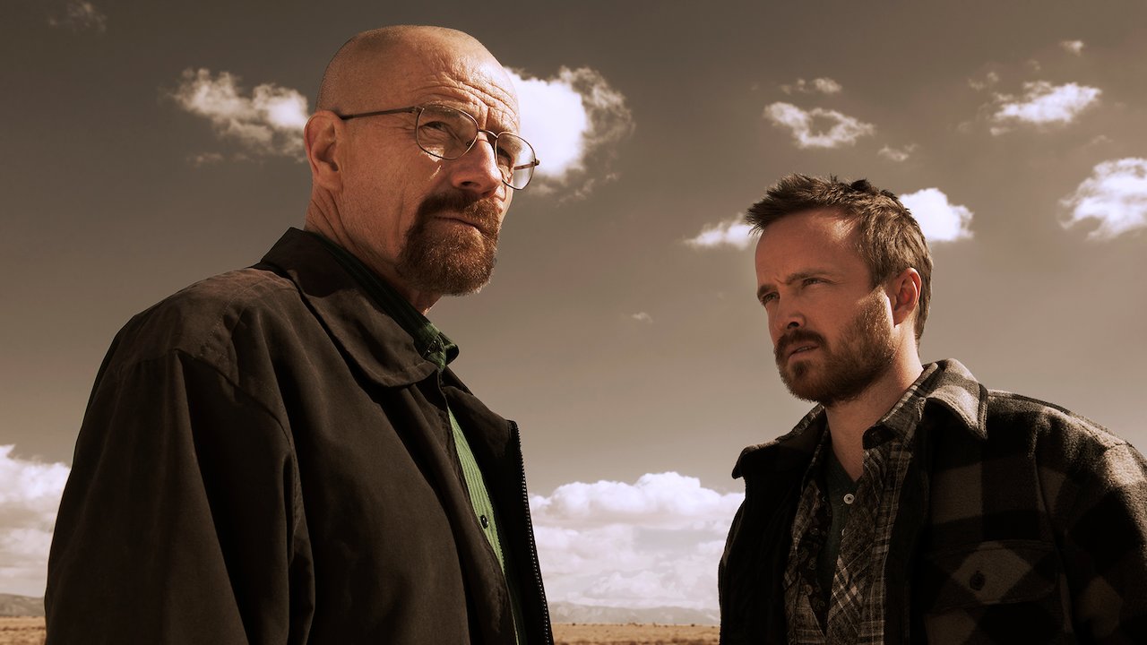
The juxtaposition of the stability of the two fonts also mimicks the polarity between the personalities of the two main characters, Walter and Jesse, and by incorporating the two typographys into the same word shows how the are able to work together despite their differences.
Another important element of the title of Breaking Bad is how it uses the colour green very prominently in its otherwise white text. Green is used for a number of reasons, the first is to represent money. The reason Walter starts building his meth empire is to make money for his family for after he dies, and being that it’s a cash business - he only works with ‘green’. Another reason is that green represents envy, and Walter is clearly shown to resent his former coworker who made millions from a business that he co-founded and sold his shares to prematurely. There is also an interesting link between the colour green and the meth-making business itself; the meth the pair produce is blue and the suits they wear when making it is yellow, both colours adding up to green.

Breaking Bad’s title typography is definitely iconic, even T-shirts fans of the show wear often showcase only the periodic table element boxes in the position they are in and the context is immediately recognisable. While it may seem like the typography was just a quirky choice, it’s clear a lot of thought was put into creating a title that aptly encompassed so many themes of the show. Clever stuff Vince Gilligan, we hope to see a lot more from this producer!
