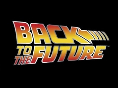
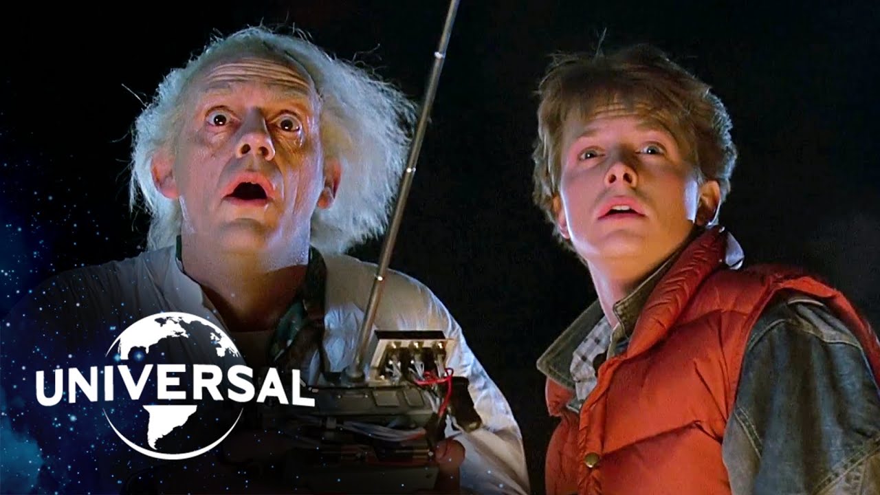
Great Scott! Here’s a blast from the past, Marty McFly and the Delorien in all their 80s glory. But the title text of the film here really steals the show. It’s bold and bright, and seems to be flying off the screen - the slanting of the letters gives the font a dynamic feel, as if it’s about to whoosh right off the page.

The font is in all caps, with a heavy weight and sans-serif - as bold as text can get! The colour choice is bright and a clever combination of yellow which, as its a happy colour, suggests a comical nature, while the red alludes to some blood-pumping action and a romantic element to the plot. There would be no doubt to a viewer that this is a fast-paced action film with bonus features of comedy and romance. And *spoilers* we see a car/skateboard chase, a car crash into a barn, Libyans firing machine guns, an awkward infatuation, a new romance forming, and an eccentric professor providing a variety of hilariously quotable lines. So - the typographical choices here definitely work!
The colour of the text is also in a gradient from red to yellow and back to red. This gives the text a rounded look which makes it seem to rise off the page. The text has a border which also has a gradient, alternating from bright white to grey it gives a slightly metallic look to the text which is a reference to the metal of the car which is featured in the poster.

Two other interesting features of the typography are:
- The text is all in a justified alignment - although slanted and at a slight diagonal to each other meeting in the middle, all the text fits into a neat block with the word “BACK” being larger than the rest, drawing more attention to the time-travelling to the past plot.
- The arrow icon in the text - a further clue to the plot, and it reinforces that dynamic feel to the title that seems to be pulling the viewer into a backwards direction.

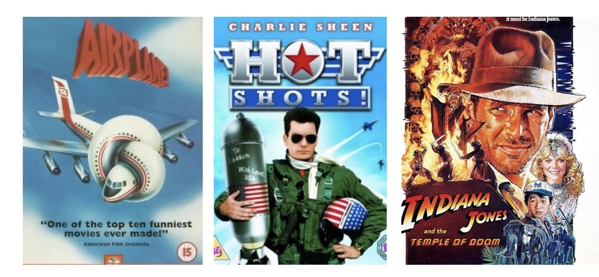
The typography for this poster is demonstrative of the common stylistic features of other posters in its time. Above are examples of other popular 80s films with similar themes; comedy and action. Note the same dynamic slanted feature in both the Airplane and Indiana Jones poster, the Hot Shots poster has the same justified alignment and metallic gradient border as the Back to the Future poster. The Indiana Jones poster also shares the red to yellow gradient, and all of the above are written in all caps. So not only are we able to tell the theme of this film just by the typography, we can see the time period it came from.
The typography in this poster is well thought out and incredibly effective in giving viewers a taste of what’s to come in the film they’re about to watch.
What could you tell about the film just by analysing the typography? Leave your thoughts below!
