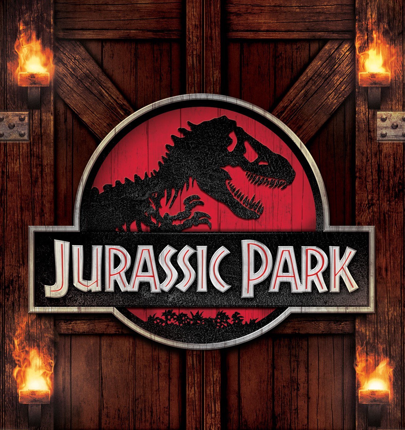
In this 1993 classic, Spielberg introduced us to a world where it was possible to meet our prehistoric predecessors. Jurassic Park brought our childhood dreams of seeing real living dinosaurs to life with its crazy science and then scared us into changing our minds. Now the logo is so iconic that its replicated in pop culture everywhere and is always associated with the film franchise.
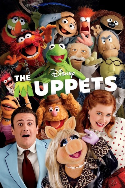
This is a really fun one that caught my eye, The Muppets movie released in 2012 in the UK is still a big favourite among children (and most of their parents) around the world. Created by Jim Henson, this enterprise has been going since 1955 - that’s over six decades! The show is full of characters with unique personalities, though none are as loved or recognisable as Kermit the frog, and that’s one of the reasons this typography is so unique.
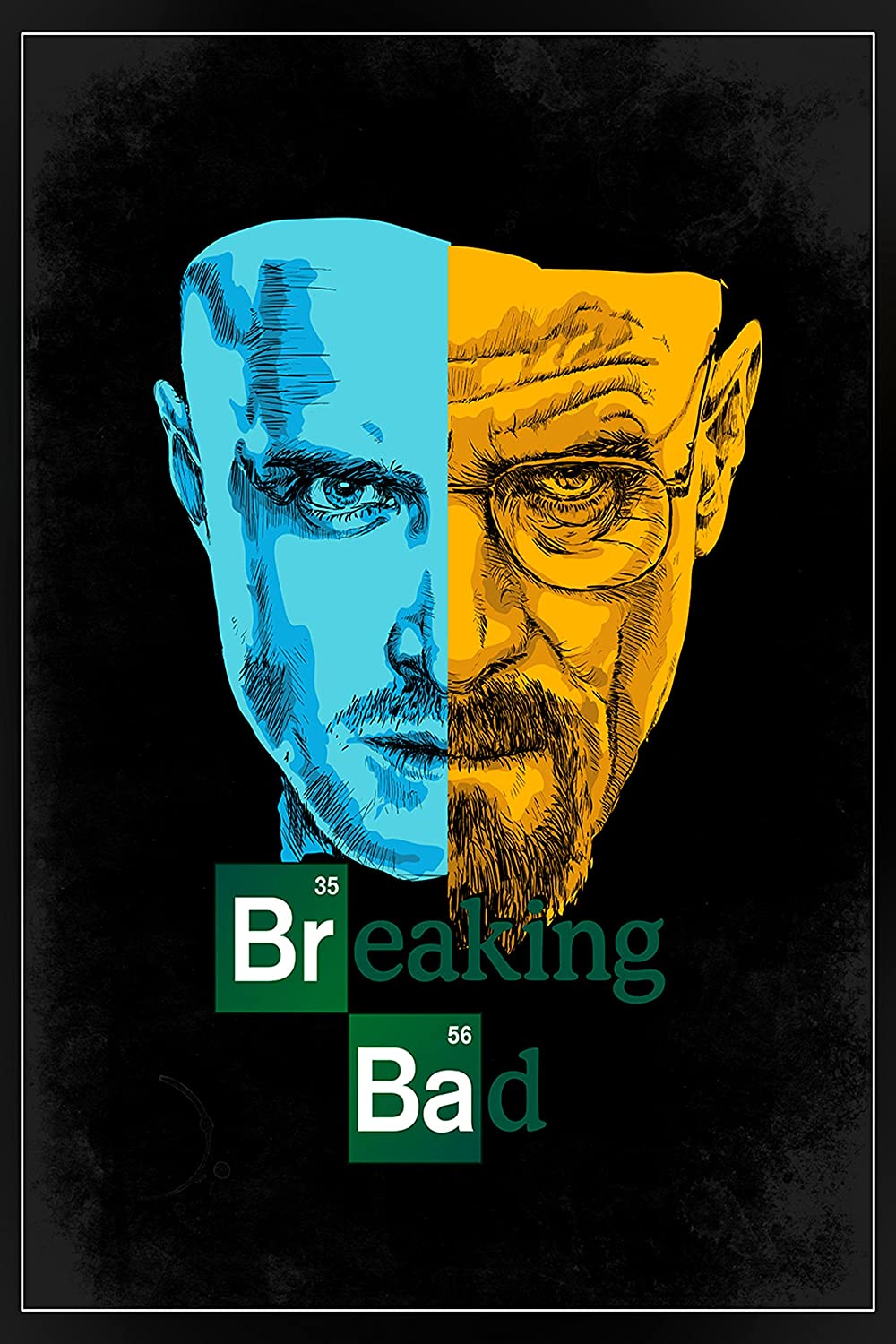
Widely considered to be one of the best TV shows to ever grace our screens, Breaking Bad brought us a desperate meth-slinging chemistry teacher on a downward spiral into a life of crime. Walter White was such a compelling character because unlike your standard on-screen druglord, this guy really knew his chemistry. That is why the incorporation of the chemical symbols in the title of the show works so well!
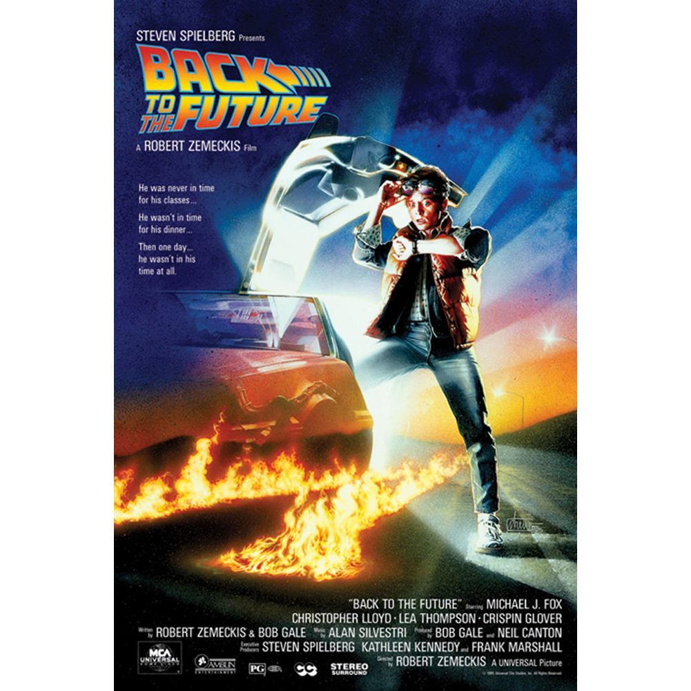
Great Scott! Here’s a blast from the past, Marty McFly and the Delorien in all their 80s glory. But the title text of the film here really steals the show. It’s bold and bright, and seems to be flying off the screen - the slanting of the letters gives the font a dynamic feel, as if it’s about to whoosh right off the page.
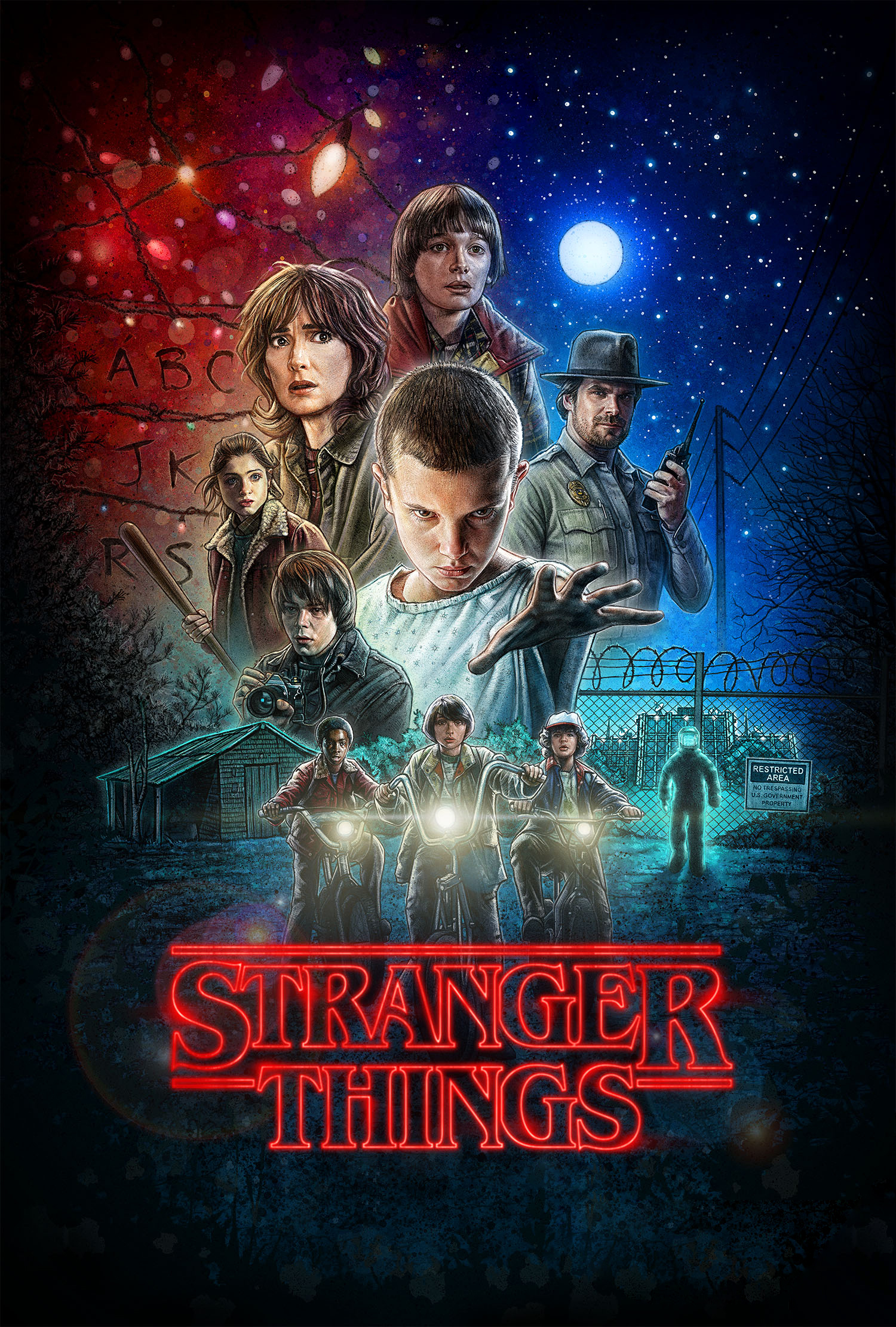
Our favourite wallet-friendly retailer Primark has a new range of Stranger Things merchandise out and it’s worth getting excited about! The design is visually stunning with a collage of characters rising above the red neon light of the title that so many of us have come to know and love. But why is the text the most striking part of the design?
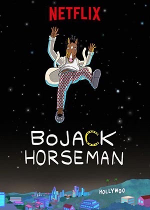
The titular love or hate character of the popular Netflix show recently hung up his hooves after the series concluded with a poignant chat on a roof, but Bojack Horseman will likely stick around in fan’s minds for years to come. Not only is the washed-up actor a relatable example of disappointment and perseverance, the iconic typographical style of the title (his name) is immediately recognisable and uniquely stylistic.